
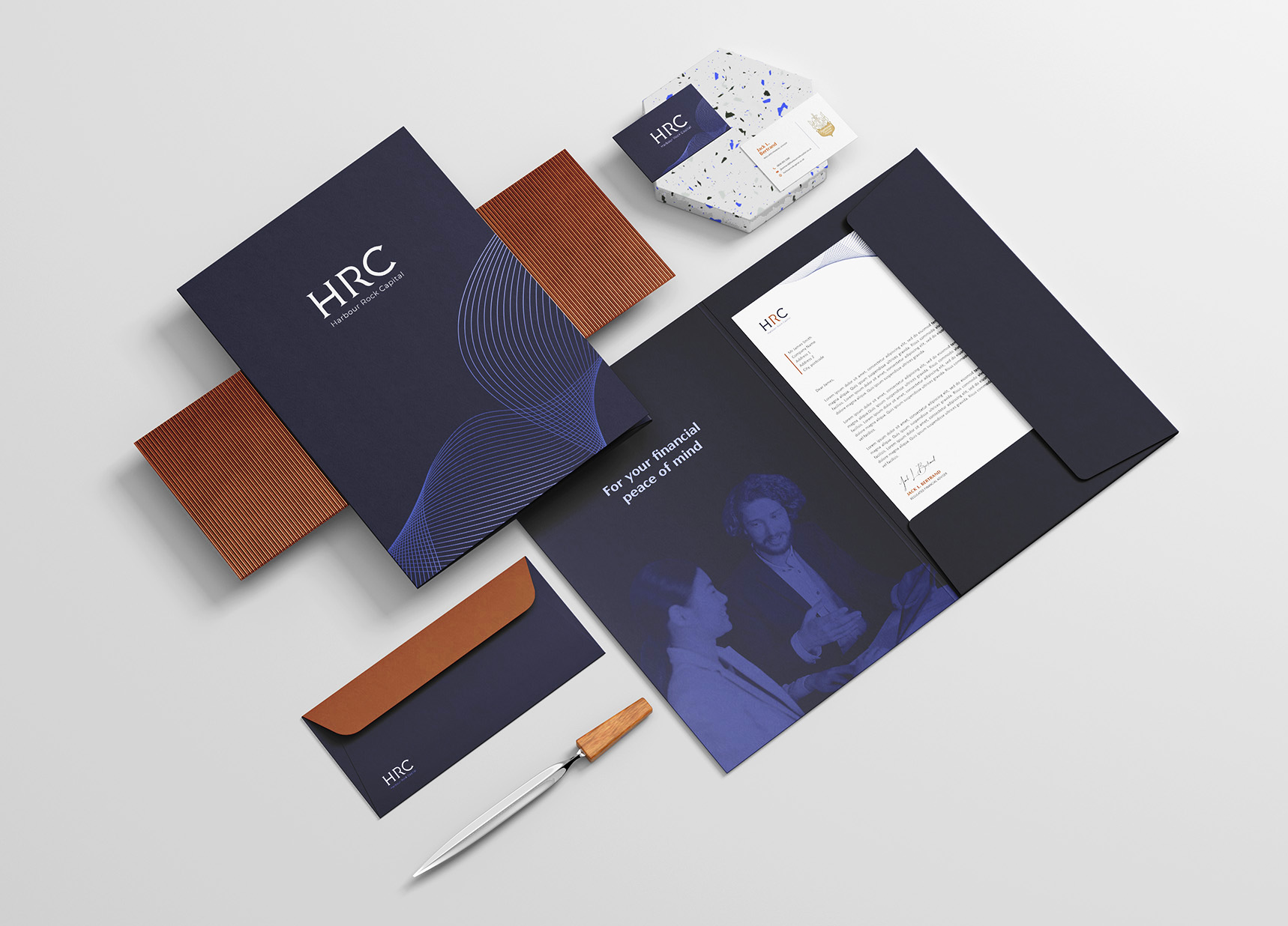
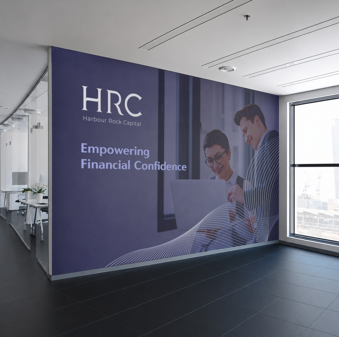
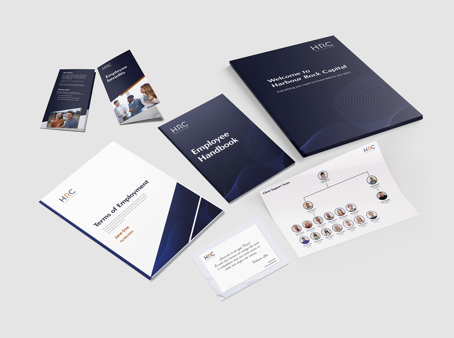
I led the development and rollout of a new visual identity for Harbour Rock Capital, establishing a flexible brand system designed to support future growth across the wider business. Alongside this work, I separately developed Pension Access, the company’s first sub-brand, ensuring both identities worked cohesively across various touchpoints.
With limited direction from senior management, the project relied heavily on my research, interpretation of the company’s goals, and understanding of the financial services landscape. The result was a clear and scalable brand system delivered on time, on budget, and with strong internal buy-in.
Content assets designed
Development time
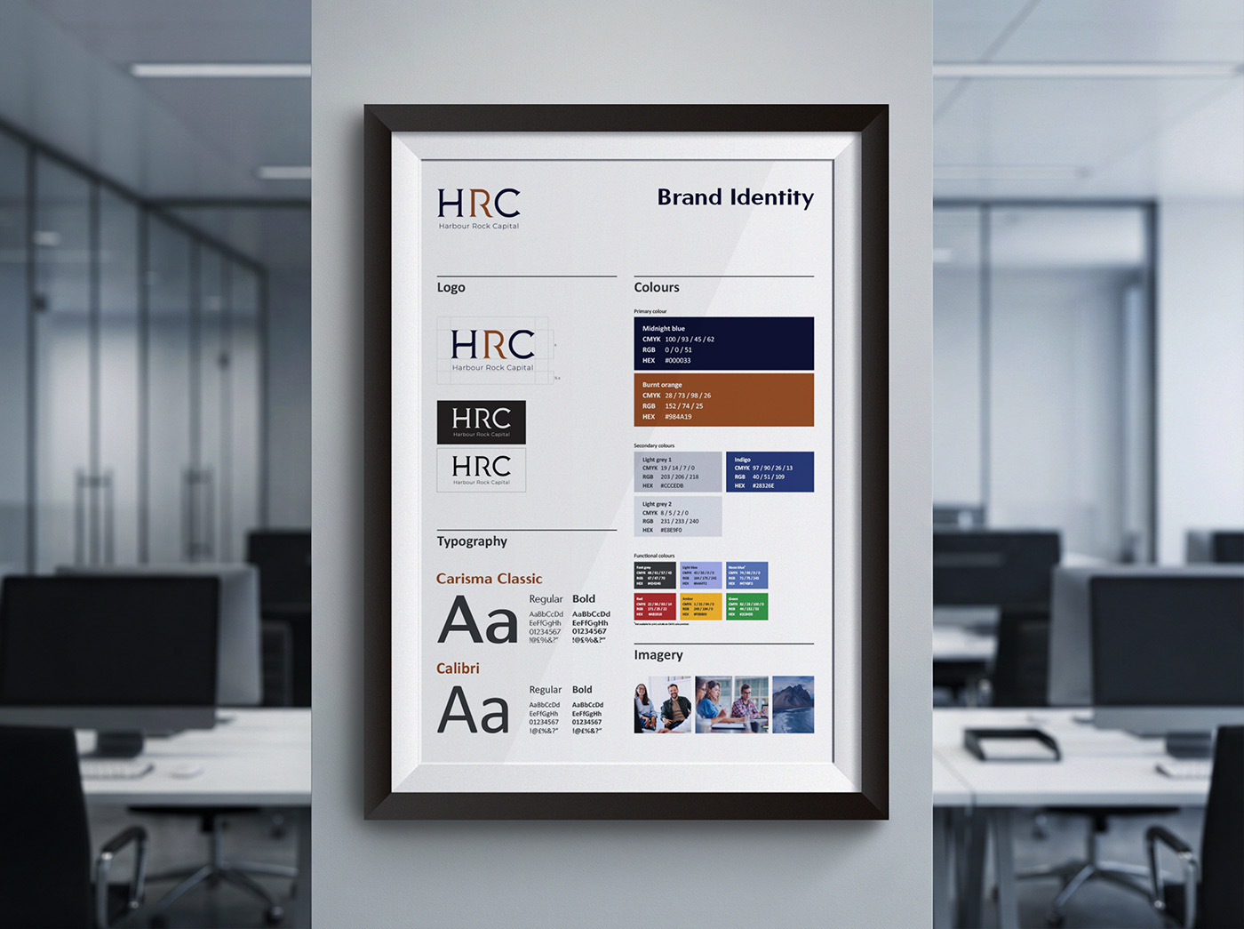
When I joined the project, a logo was already in place. I set the creative direction for the company’s overall brand style, grounding the work in competitor research and the needs of a holding company brand.
With Harbour Rock Capital positioned above a single sub-brand (with plans to expand), the visual language needed to remain clean, corporate, and flexible rather than expressive or trend-led.
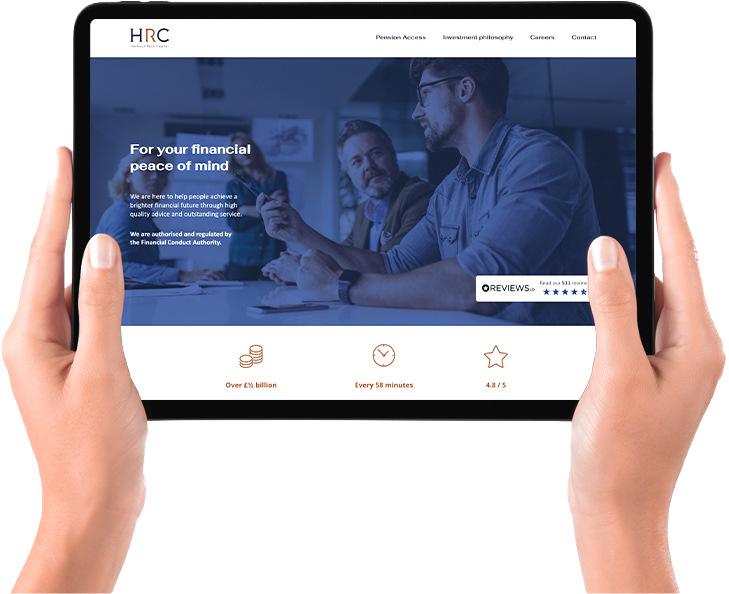


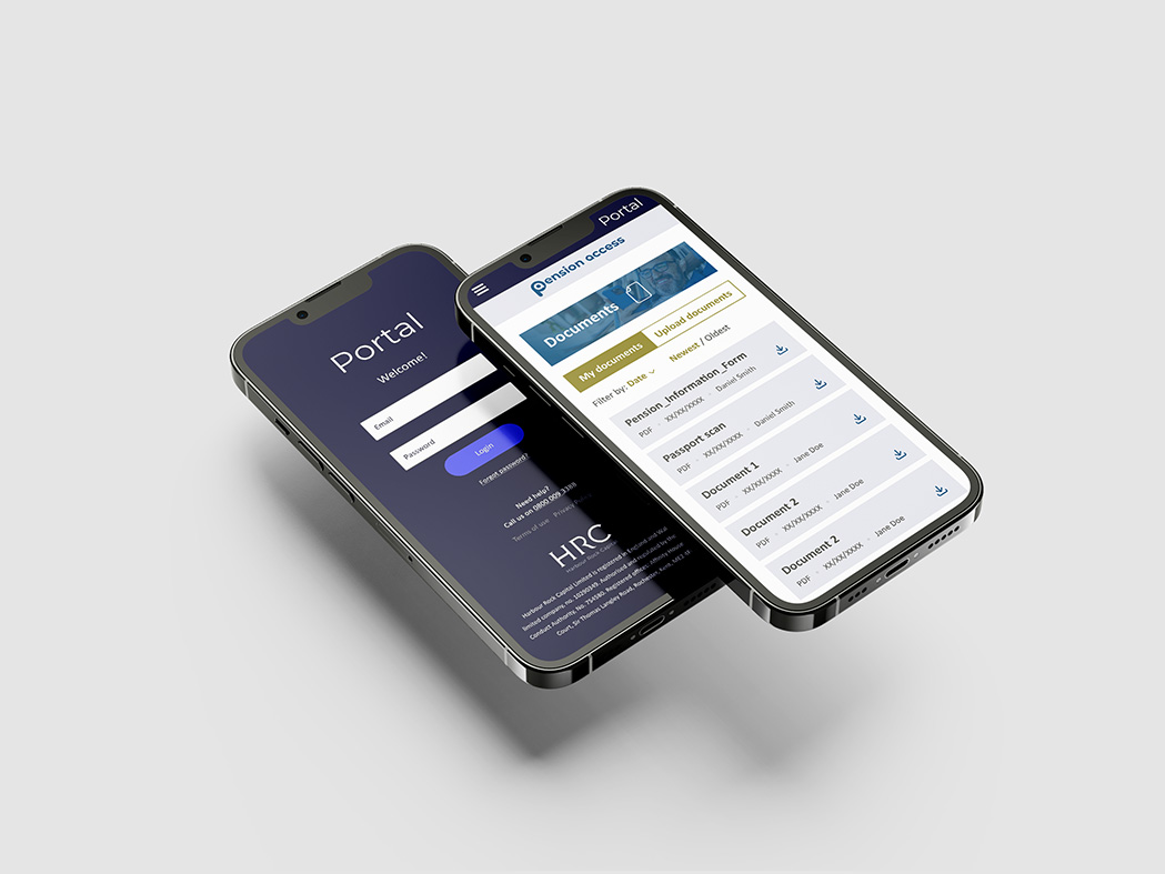
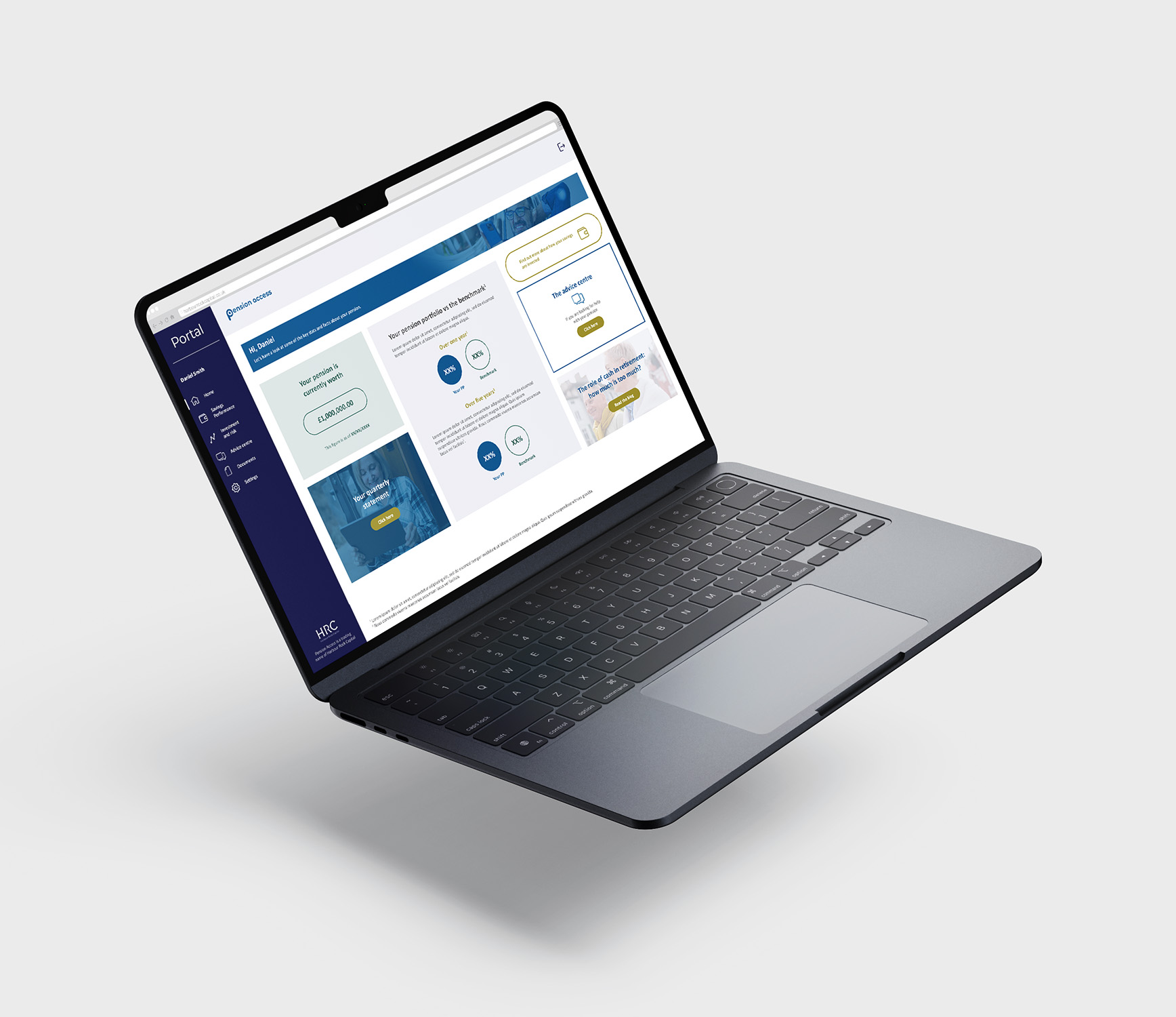
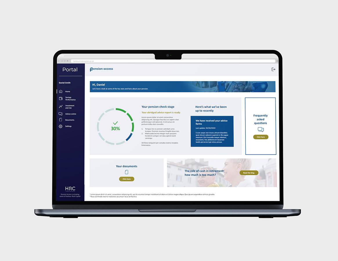
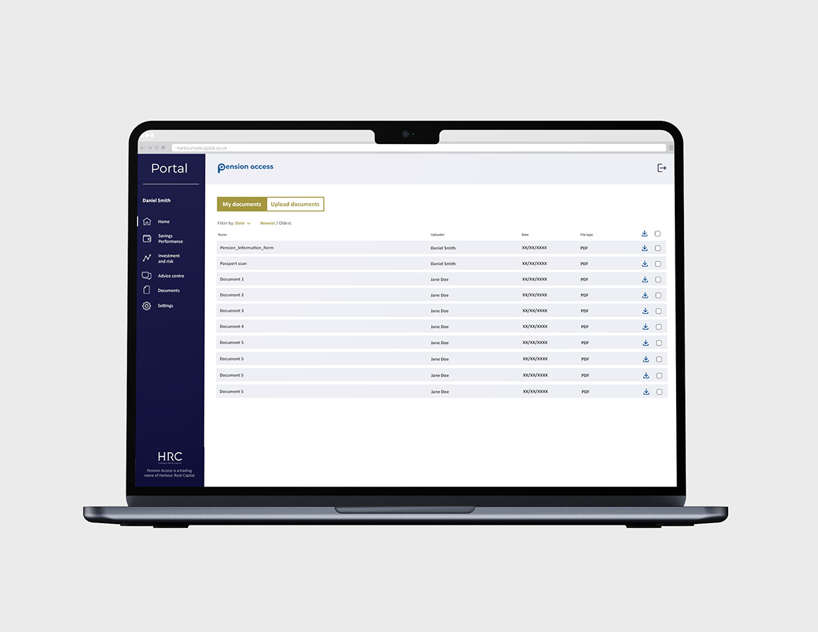
I led the visual design of the company’s online client portal, developing a flexible UI system that combined the core Harbour Rock Capital brand with service-specific sub-brand styling. While the portal structure remained consistent, the dashboard's visual accents adapted to each service, creating a scalable system designed to support future sub-brands. Using an iterative approach, I produced a complete set of responsive page designs ready for build in Salesforce.
Anna is an exceptional graphic designer and brand specialist. She joined us a month into a major project to create and deliver two new brands. With just names and logos agreed, minimal direction from the board and my hairline severely receding, Anna read the room and took control.
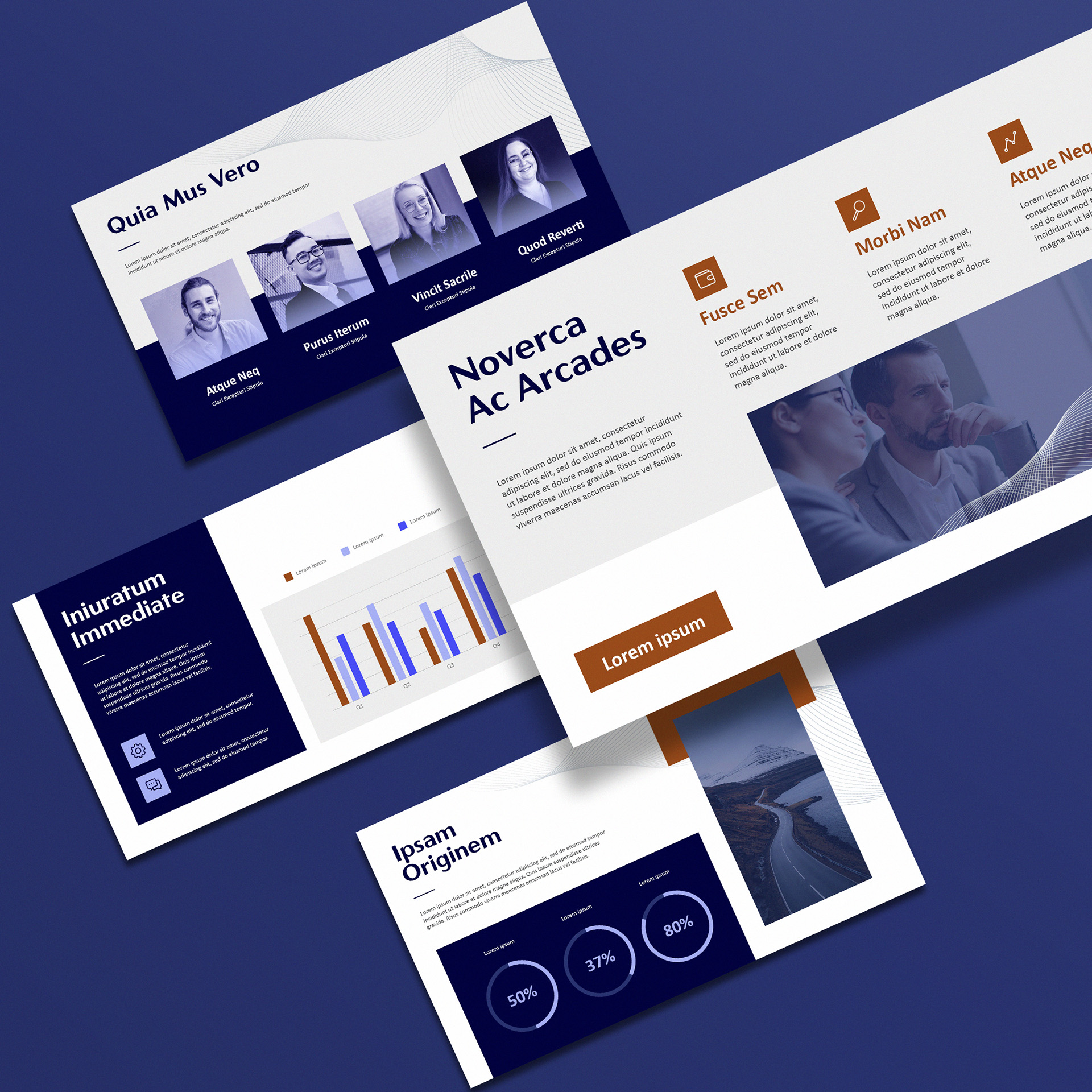
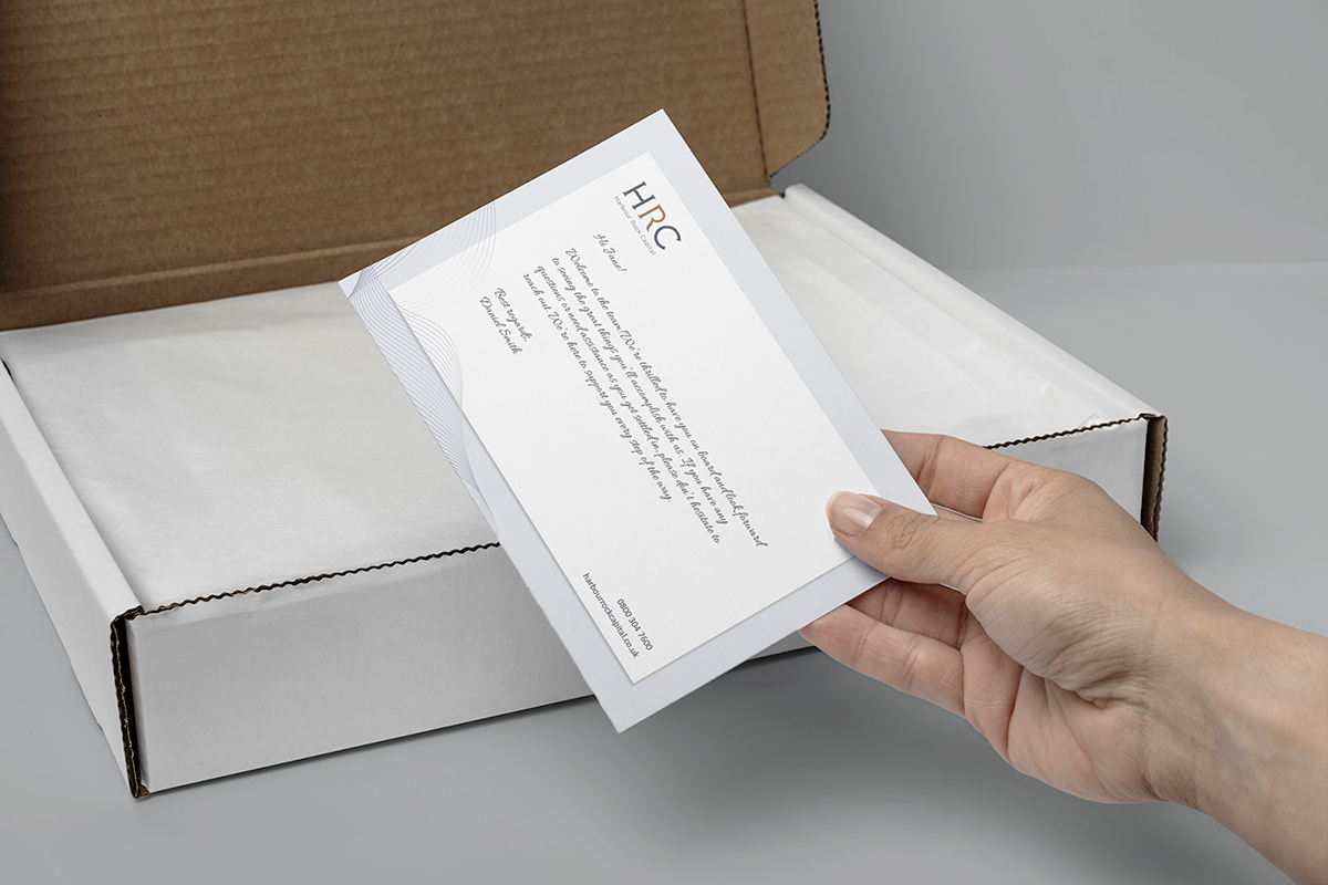
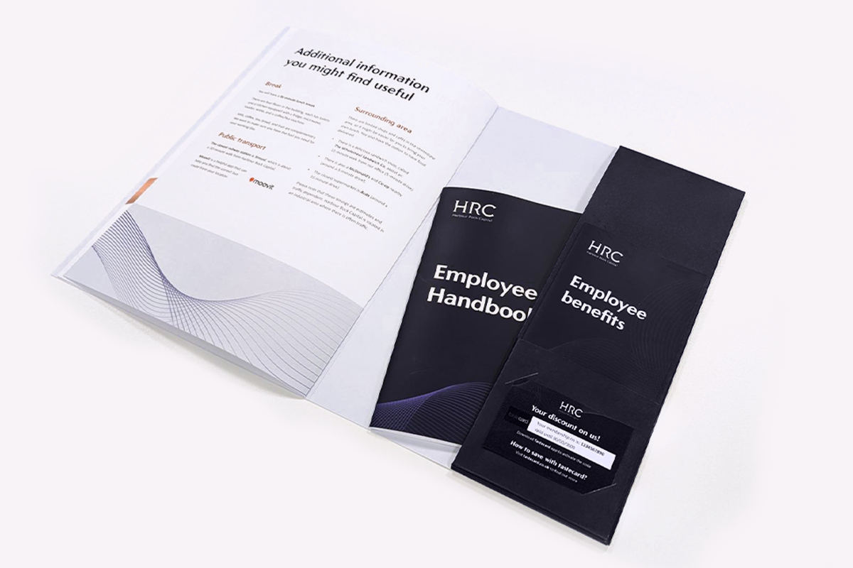
Under extreme pressure, and in a new environment, she brought to life the two new brands, developing on the fly frameworks and guidelines that all stakeholders bought into. She then applied this rationale across 100+ existing and new content assets in a calm and methodical manner, without missing a beat or a deadline.
Logo design - Pauline Caleno
Copywriting - Victoria Amundsen