ellenor Charity

Revitalising Charity Brand

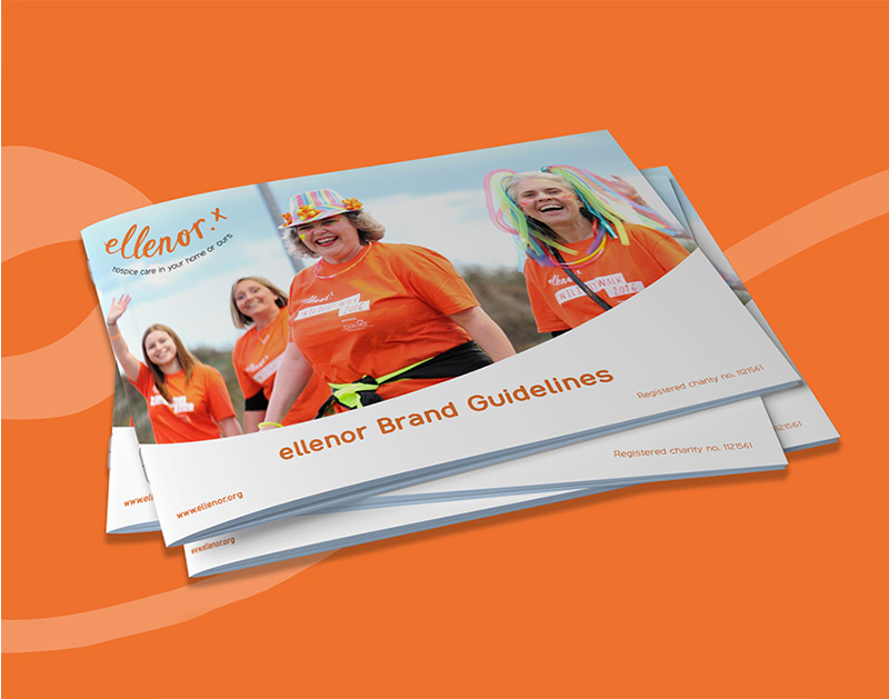
Following the introduction of a new strapline to the charity’s existing logo, the organisation began refining its mission, vision and values with the marketing team and external stakeholders. I identified an opportunity to extend this into a wider review of the brand guidelines, leading the visual refresh and supporting managers through internal brand training. The outcome was a more authentic and consistent identity that better reflected the organisation’s personality and resonated more strongly with staff and audiences.

Deliverables:

  • Refined brand guidelines and visual system toolkit
  • Brand assets
  • Mascot expansion and usage system
  • Brand photography
  • Internal brand training

Visual Identity Refresh

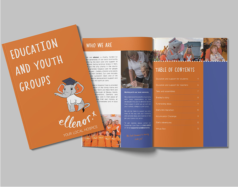
I refined the brand guidelines to introduce a more vibrant and expressive visual style while maintaining accessibility and suitability for a hospice setting. This included updated colour usage, more flexible layout rules, and replacing black and white illustrations with colourful minimalist vector illustrations that were easier to expand and apply consistently.
Key challenge:
The existing style didn't reflect the charity’s warm, human-centred personality, while a limited asset library led to inconsistent asset use across teams.

Ellie the Elephant

I expanded the existing Ellie the Elephant mascot into a wider range of poses and applications for campaigns, fundraising events and children’s care materials, helping bring more personality and familiarity into the brand.

Brand Photography

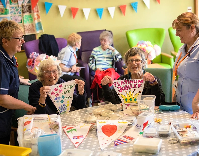
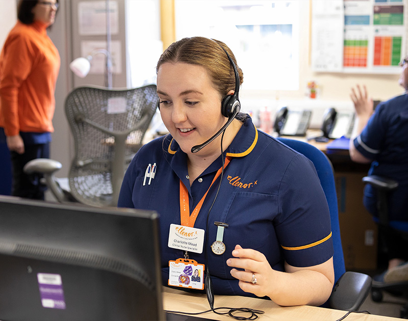
I did a series of photography sessions with employees and patients, capturing natural imagery that reflected the hospice and its community.
Brand Rollout

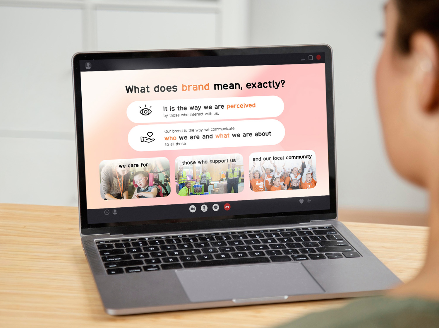
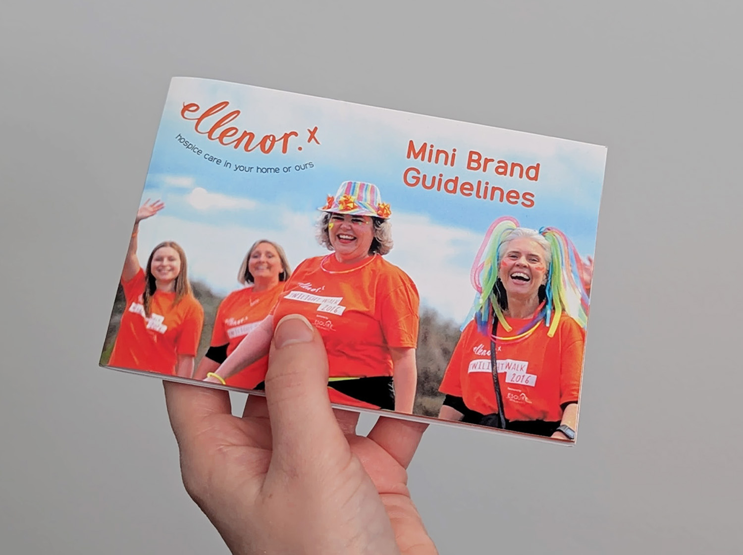
To support rollout, I delivered internal brand training for managers and created compact pocket guidelines covering key principles and essential assets.
Credits:

Logo design - Wire Design